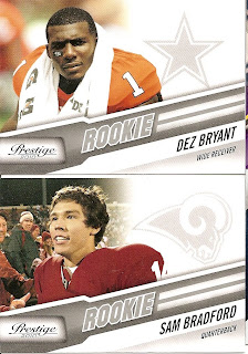
I picked up some packs of 2010 Panini Prestige Football and I have to say that I am disappointed. I cannot understand the fascination that Panini has with lines and angles; every card set has some odd angle to them. The designers must begin with a protractor and a blank card and go from there. Now there is a way to work angles in to a design and still have something worth looking at and then there is a way to ruin a card from the start.
Using the Prestige base card I created a mock up using the current base design to give the card a more pleasing aesthetic. Base above left, mock up above right.
Using the Prestige base card I created a mock up using the current base design to give the card a more pleasing aesthetic. Base above left, mock up above right.
I pulled a couple of rookies including Sam Bradford, Dexter McCluster and Dez Bryant. I actually kind of like the rookies, they are set up perfectly for the autograph, which unfortunately is a lick-em stick-em auto.
The insert sets are another round of crazy angles and colors with foil board tossed in to add that extra irritation you already feel by the time you pull an insert.


No comments:
Post a Comment