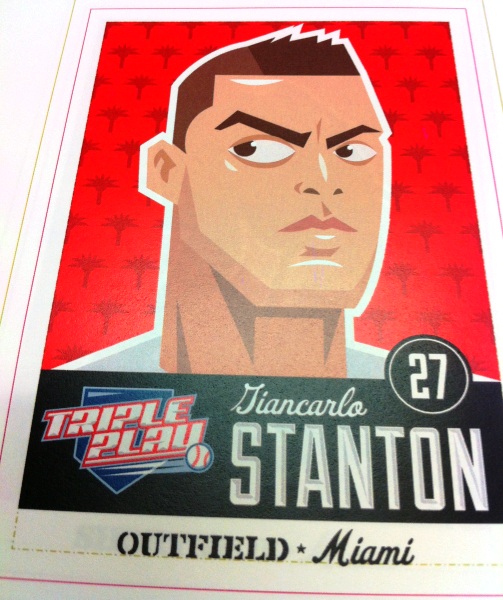
In late July Panini will be releasing
2012 Triple Play Baseball, a return to the original Triple Play releases from
the early 1990s. These sets were geared towards young collectors and the packs
sold for under $1 each, Panini has decided to carry over this tradition to the
modern set. Once again the packs will sell for 99 cents, with 24 packs per box,
and the base set will consist of a 90-card checklist with a handful of insert
sets.
To create a varied base set Panini
commissioned a number of artists so you will notice differences between
players. Most appear to have a super hero styling straight out of a comic book
but there are some that look more realistic while others are cartoonish.
Some of the inserts include
“Focus”, featuring a close up shot of one player from each team, “Baseball 101”;
cards include hints and rules for the game and “Hall of Fame”, featuring first
ballot inductees. There are also Eye Black stickers, Temp Tattoos and Real Feel
memorabilia cards.
Because Panini only has a MLBPA
license they were unable to incorporate logos or team names so you will notice
that in the background of most of the cards, instead of including the team’s
logo, they went with other icons to represent the team or city. So Yu Darvish
has a Texas state silhouette, Ichiro has an anchor, Brian Wilson has a Golden
Gate Bridge silhouette, Carlos Lee has
rockets and so on.
The one thing that bothers me
about the design is the overloading of information on the front, there is the
Triple Play logo, player’s name, uniform number, position and team location. It
seems to be more noticeable on the horizontal cards because they added the
team’s location within the design instead of on the border with player
position. I think removing the uniform number would have been a start and
making the cards uniform by placing the team’s location on the border on all
cards, vertical or horizontal layout, would help with chaos.